
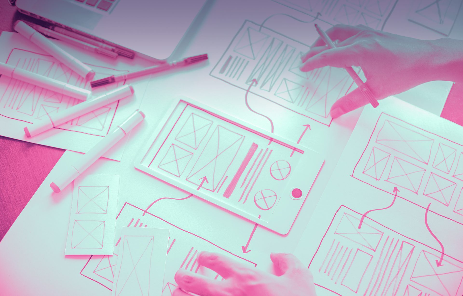
process
Quantitative research
Working for small agencies and start-ups I have had to wear many hats. One such hat is UX Researcher. It may come as a surprise to some, but on some projects there is very little budget for research or it is not deemed to be necessary. My approach is this: it is always necessary, and I will find ways to do it myself. Throughout my career I have conducted phone interviews, face-to-face interviews or online surveys. With many years of experience interviewing people for life insurance applications, this comes naturally for me.
Working at Princeton we would regularly take advantage of our large database of doctors, and I would use Survey Monkey, Mail Chimp and other ape based software <joke/> to obtain useful data for UX and marketing.
Affinity mapping
Affinity maps are a great way of collating large amounts of data or ideas into groups and looking for commonalities. In the context of web/app design, this can really help you find common pain points and solidify problems. In the example shown I had performed three rounds of quantitative research and needed to make sense of the results. I was researching problems in the workplace. I found three common pain points and organised them accordingly:
- Boredom / job satisfaction (blue)
- Work-life balance (purple)
- Conflict with management (yellow)

The findings from a survey on issues in the workplace.
Competitor analysis
This should be done regularly through a product’s lifecycle. Whilst adding more features does not necessarily mean a better product, you want to make sure you are on top of any game-changers. After all, you want your product to be the most competitive. The process is very simple. Create a spreadsheet and work through an app/website one at a time noting down all the features. Look for the same features in the next product, note them down, and if there are any other new features you discover, note them down too.

Feature comparison table of different gambling platforms. It also includes streaming platforms that are not gambling. It is good practice to compare digital products in different industries as they may contain interesting features that you might not have considered.
Feature prioritisation workshops
Features can come from anyway. The sales team may gather feedback, the CEO may have given a directive or perhaps a new feature was spotted in a competitor’s product. Whatever the source for the new feature, it is up to the UX team to help guide the process for prioritising. Prioritising features is a good opportunity to involve other stakeholders, in particular developers. This is a great time to bring them on board and get buy-in from them.
There are many methods for this, the method I have used the most to good effect is a prioritisation matrix. Again, there are a number of different matrices to use – the two I have used to good effect are mapping what features are expected against what will have a high impact to the end user. Another effective matrix to use is one that pitches value against complexity.
Prioritising features based on (hypothetical) user engagement

Prioritising features based on value to customer and complexity/risk of development

The examples above were used to determine what features would be used for an eSports betting platform. Participants included the design team, a project manager and several developers. Post-it notes were stuck to a wall, and I translated the results into an Illustrator file so it could be shared with other stakeholders.
User flow diagrams
If the user needs to make a lot of decisions to perform a task, it is a good idea to create user flow diagrams before moving to a wireframe. A user flow diagram is much quicker to produce than a wireframe. The will help stakeholders understand the complexity of a feature and help back end developers to scope out the design of the back end.

The above flow chart was used as a starting point to map out a group dining feature for SmartTable. The diagram was useful for illustrating how complex the feature is and how it could potentially create pain points for the customer (e.g. what happens if the host is late?).
User journeys
User journeys help paint the broader picture of how your digital product impacts the real world. It shows the touch points and the path the user takes to fulfil their task and what happens at each touch point. The purpose of a user journey document is to give stakeholders an overview of how the product works and it can be useful for finding pain points and honing processes. Illustrations can be helpful, though are not necessary.

User journeys, showing the touchpoints for when a consumer interacts with SmartTable and how that information is received and acted upon by the vendor.
Architecture
Site maps are not just for websites – they’re for native apps to. I like to organise the hierarchy of information into sitemaps. If necessary, I will use tools like optimal sort or conduct surveys to discover users’ expectations of where items should be located.

Architecture design for SubbyFinder, a trades service finding application. Multiple ones were made for each user type.
Obviously there is much more to UX than what you see here. I’m still in the process of populating the content on this page. I am also currently open to new opportunities. Are you working on something exciting? Contact me.