

Creating an engaging game to hook young students into improving their spelling.
| Product | Readiracer – online activity for classrooms |
|---|---|
| Enterprise | 3P Learning |
| Year | 2020 |
| Project methodology | Hybrid |
| Target audience | Primary school teachers to use with students in grades K-6 |
| Role | UX Design, sound design and some UI and animation |

Problem statement
Students sometimes do not see the value in learning to spell, find it difficult to learn and can become demotivated.
Starting in space
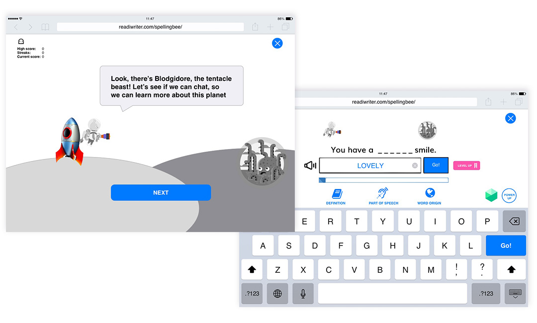
Starting at 3P on a two week contract I was tasked with designing a simple spelling game. I didn’t have much in the way of a brief – just that it was to target years 1-3 (ages 6-9) and each word needed to include information to help students, such as the word’s definition, origin and part-of-speech.
Instructed to avoid any potentially violent or offensive themes I landed on a space exploration theme which fitted some of the existing artwork and themes used in 3P products. Titled “Spellenium”, students would explore planets and get to know the planets’ creatures by spelling words to converse with them – the intention being that this would provide an extrinsic motivator for students as they learn that accurate spelling will make you a better communicator.
This idea was rejected by decision makers for the same reason I chose it – “3P already had space themed activities”. The concept was also critiqued as not being engaging enough.
Coming down to Earth
Working with a Product Designer, Spellenium was transformed into a deck building game with a Caribbean paranormal theme. However the deck building mechanics of the game were assessed by education specialists to detract from the core purpose of teaching spelling and possibly be too complicated for early learners. The project was parked temporarily.


Back to the drawing board
With a roadmap bursting at the seems it took some time before building a game for Readiwriter to become a priority again.
From 20 hastily scribbled concepts I whittled down a shortlist to present to stakeholders. Based on the need to attract males (who fare more poorly at literacy than females), the votes were unanimous – the game would be a car game – Readiracer.
LoFi Wireframe and Prototype
Once the concept was approved, the next stage was to mock up a very rough wireframe and prototype. Creating animated gifs in Adobe Animate and importing them into Invision allowed the team to come to an understanding of the game mechanics and how how moving graphics can give the illusion of forward motion. It was important to show this early on.
The game mechanics were kept simple. We avoided power-ups or anything to do with steering the vehicle so the students would not be overwhelmed with inputs and tasks. Their objective was simple: spell the words correctly to charge the battery and power the car forward, racing against the clock. There would also be a multiplayer version.
Students would play an automatically generated wordlist, revising words they had repeatedly misspelled. If they were new to Readiwriter, they would play a default list.
With only a small amount of feedback on the prototype, it was quickly handed over to the UI designer.
Driving ahead with UI design and animation
The development team moved impressively fast, however I felt the first cut was not yet fit for release. The animations were very static and there were responsive issues on iPad. Customers have certain expectations around quality and usability, however key stakeholders also had expectations around a release date – the classic business needs vs user needs! How could I convince the team that the build should be improved before release?
Students would play an automatically generated wordlist, revising words they had repeatedly misspelled. If they were new to Readiwriter, they would play a default list.
With only a small amount of feedback on the prototype, it was quickly handed over to the UI designer.
Screen recording of Readiracer – it took a lot of tweaking to get there.
Internal usability testing
The development team moved impressively fast, however I felt the first cut was not yet fit for release. The animations were very static and there were responsive issues on iPad. Customers have certain expectations around quality and usability, however key stakeholders also had expectations around a release date – the classic business needs vs user needs! How could I convince the team that the build should be improved before release?

Fortunately i was able to conduct some testing – albeit internal testing. I sent a company wide email and asked candidates to try the game in the QA environment. If they had children in the target age group use it, even better. 17 people responded and filled in a survey. Results confirmed my hunch – the build was lacklustre. Asked “Overall, how engaging do you think this activity will be for K-6 students?” candidates marked it an average of 57/100. Extrapolated as a Net Promoter Score, things looked worse – an NPS of -70.
This gave us impetus to improve the build before release. I pitched in with some animation assets, teaching myself to create Lottie files in AfterEffects.
Sound Check: one, two!
We originally considered sound controls as a “nice to have” that would be included in a later release, however we received overwhelming feedback that they were needed. Users needed to be instructed that sound is necessary to play the game (so they could hear the sentence) and they needed an opportunity to sort the sound out before the game started. We created a dashboard at the beginning to do this and added a SFX switch within the game.

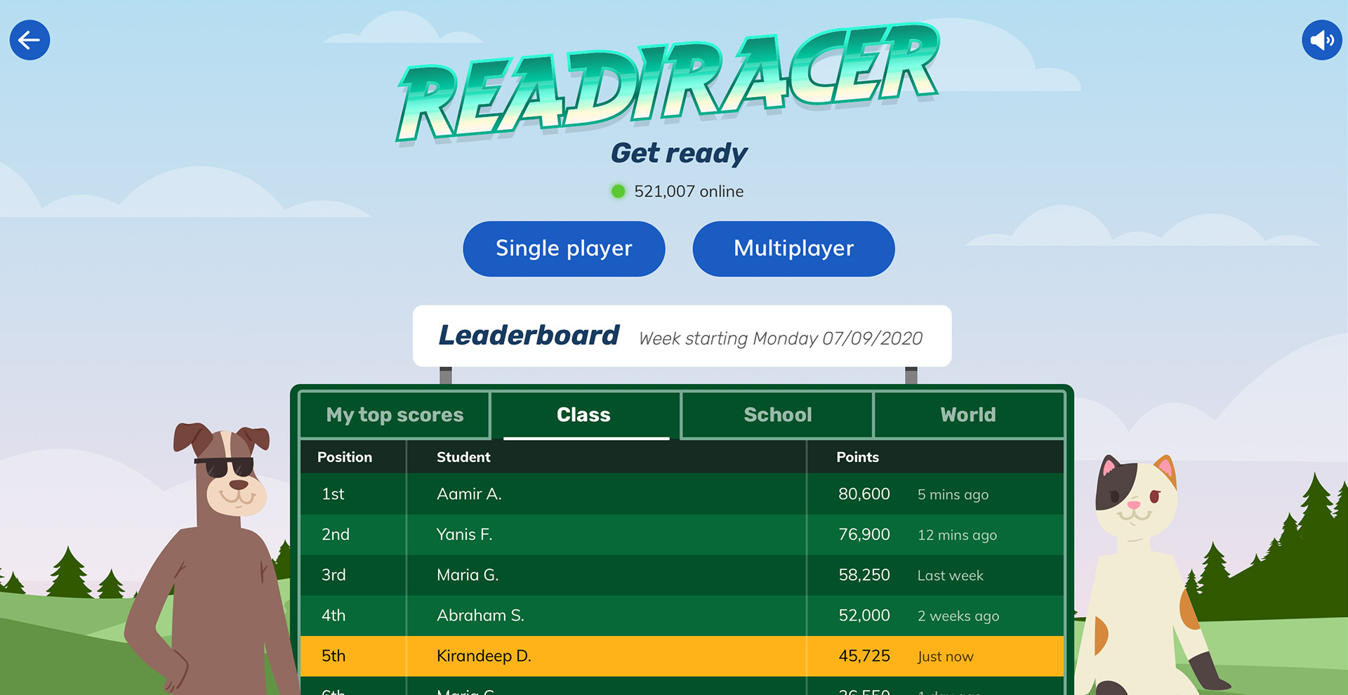
Leader of the pack
Another feature we decided to bring forward was the leaderboard, which would provide an extrinsic motivator for students to continue playing – to better their own score and beat others too.
Multiplayer
With all the improvements in production, it was time to turn our attention to multiplayer – which would potentially have a huge impact on engagement. Each student would be playing their own revision list, so no two students would be playing the same words. This would allow developing students to play against those with a higher level of spelling proficiency – and beat them, levelling the playing field and giving them a confidence boost.
Taking on the world
The player could compete against students in their class, school, country or the world. Whilst in the lobby, they could also change the colour of the vehicle.

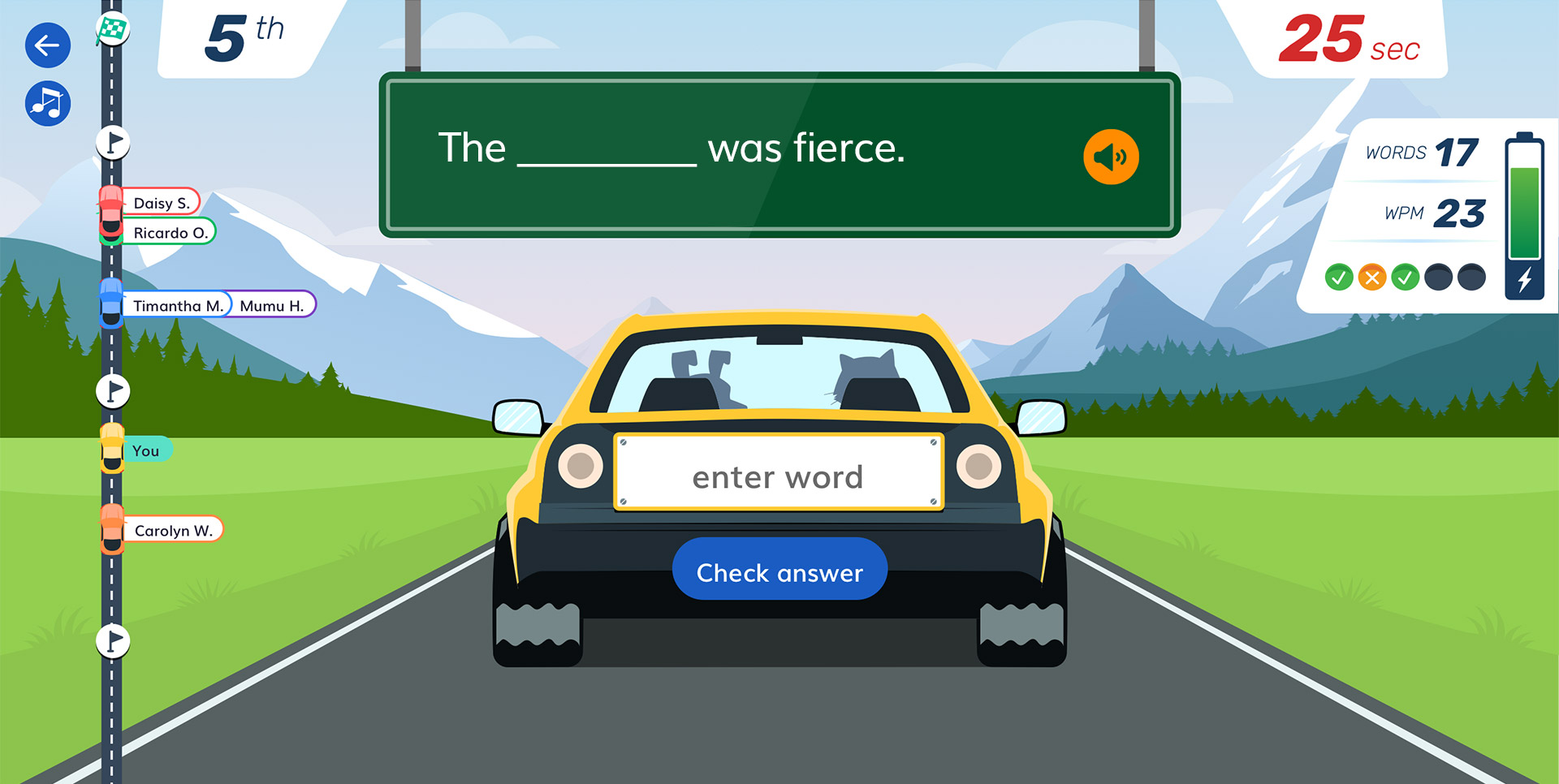
Progress
The progress of each player was shown on the progress indicator on the left of the page. It would have been great to have other players’ vehicles visible on the track, however we realised that this would take an extraordinary amount of development.
Beyond the finish line
The game consists of 5 rounds, or checkpoints – each round containing 5 sentences to complete. At the end of each checkpoint, those in the lead would receive a bonus animation. We had many ideas for animations – a Dukes of Hazzard style jump, a Hotwheels style loop-de-loop, the car travelling under water, or drifting through a corner. One animation I did get done was a pit stop. Whilst animation is definitely not my wheelhouse, it’s always good to learn something new.
It gets results
As with all Readiwriter activities, the teacher can view results of their class or each student. These include statistics for things such as highest score, fastest game and accuracy, etc. Results can be filtered over different periods of time. Importantly, the teacher could view the words that the student continued to struggle with and could copy them into a word list for further revision on other activities.
Promising engagement
Whilst not at liberty to share usage and engagement numbers, Readiracer has been the most engaging activity in the Readiwriter suite – the game was played more frequently and for longer than any other activity. That said, I did receive some reports that a significant percentage of users were not finishing the game. The game would benefit from some careful analysis of usage statistics, and some usability testing. It’s incredible that the activity has done as well as it has without these final steps of the UX Design process, and a testament to all the hard work the team put in.