| Product | SmartTable food ordering app for iOS and Android |
|---|---|
| Enterprise | Tech startup incubator |
| Year | 2018 – 2019 |
| Project methodology | Agile |
| Target audience | Hungry, tech savvy people |
| Role | Lead UX |
SmartTable allows diners to order meals and beverages directly from their smartphone without the need to wait in line or wait for service.

Identifying pain points with the MVP
SmartTable is an app that promises easy ordering. A customer can order from their table, or order their meal before arriving at the restaurant. It promised convenience for both the customer and the restaurateur.
However when I came to the project in early 2018, the app was not delivering on the promise – it was doing quite the opposite. The sales team had good success selling it into just around 80 venues, but retention was poor and many of the venues were reluctant to promote it.
A promotional trial in Boost Juice Rhodes highlighted many of the CX problems. Boost Juice staff had difficulties processing orders – they were required to continually update the status of each order to; received, processing and complete.
Useful information for the customer, but these status updates escalated the workload for staff and they were not able to keep up with the demand. There were other issues too – the only way customers could state their options was by using the notes section of the checkout. SmartTable had failed to deliver. It had created more work, not made life more convenient.
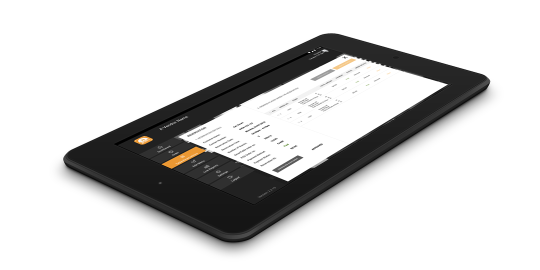
SmartTable vendor tablet competing for attention
Orders were being managed with a SmartTable Android tablet. Once accepted, the order would be printed on a Bluetooth printer and the ticket would be delivered to the kitchen. This is a similar process to Menulog and Uber Eats. This is in itself was a problem – the SmartTable tablet having to compete for space and attention with all the other food ordering service devices. The low volume of orders meant that SmartTable orders were often missed or not given priority.
Orders direct to POS
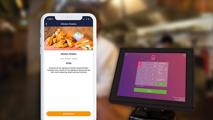
Our GM started discussions with Doshii and Impos and discovered a potential solution – integrating orders with POS. No longer would the orders be sent to a middle man – the SmartTable tablet, but they would be sent directly to the venue’s POS.
Connecting Impos and doshii
Not all of SmartTable’s features could successfully integrate with Impos. Included in the app was pre-order/takeaway (like Hey You!) and reservations (like Dimmi). As there was no longer a way to manage these features, they had to be removed and the app would just have one single focus – ordering from a table within the venue.
This came at a time when new features were being tabled such as bill splitting and a bar tab feature – anything to help sell it into more venues.
But removing features was a good thing – it helped us create a more usable experience for the core product.
Combo meals and food options
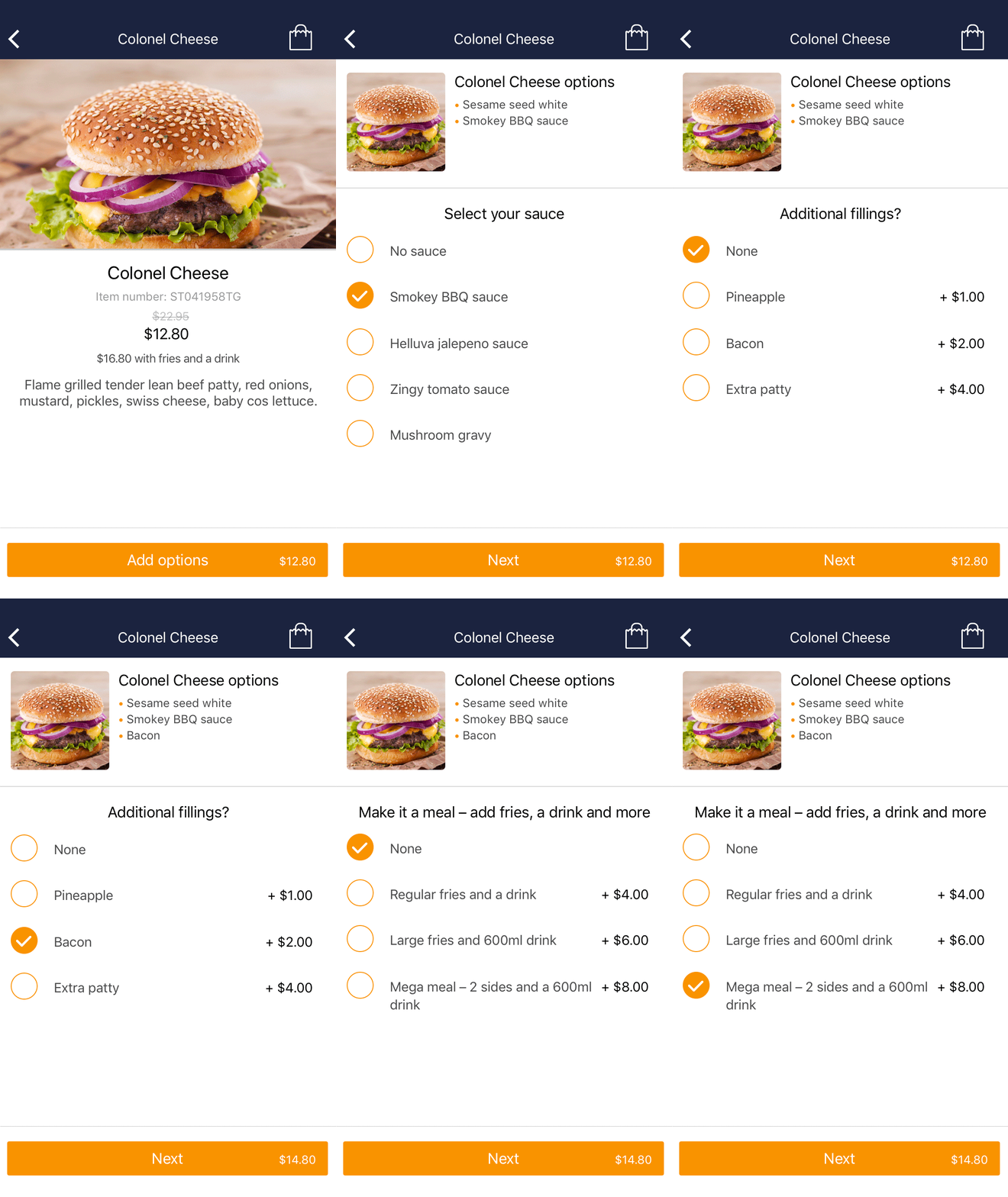
Our field research showed that meal options were a pain point. Having to type out options in the notes field can be tedious work. We wanted a system that would be flexible for a wide range of vendors. Consider ordering a kebab. What’s the filling? Chicken, beef, lamb, falafel? Onions, lettuce, tomato, hummus, tabouli…? What sauce? What drink? Side of fries or vine leaves?
I analysed what existing apps such as Menulog, Uber Eats and Deliveroo do. I also looked at eCommerce clothes apps. I like to do this, see apps in different sectors handle selecting data.
Guerilla testing the UI in Invision, I made some minor tweaks – I included pagination. I modelled the combo meal off the idea of “upselling” – giving the user the option to bundle their meal after selecting the main item (e.g. burger). I found users wanted to know the meal item could be bundled straight away. I considered using iconography, however there were too many different types of food. You might bundle chips, wings and a soft drink with a burger, but how do you use the same icon for a vindaloo, naan bread and mango lassi? In the end, we went with plain text and price indicator.
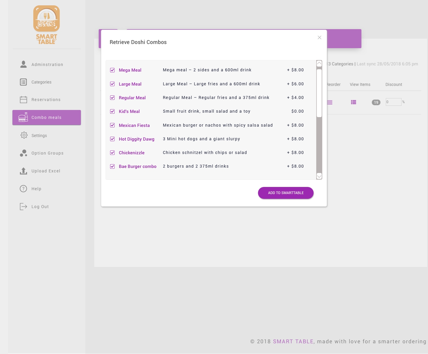
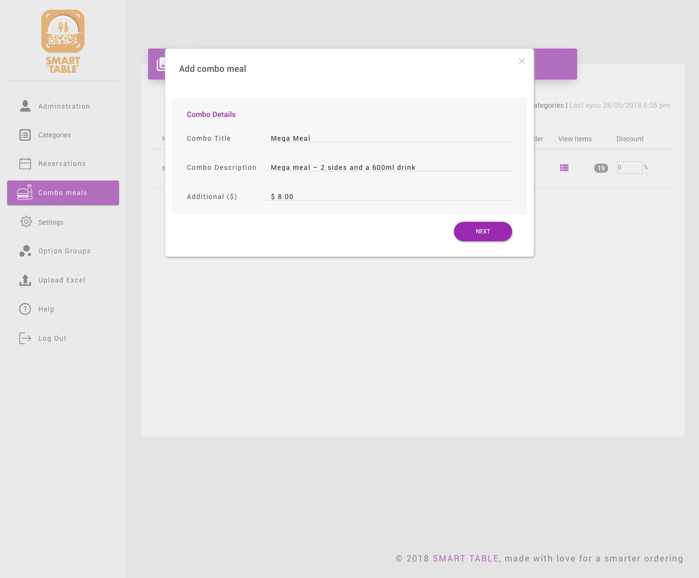
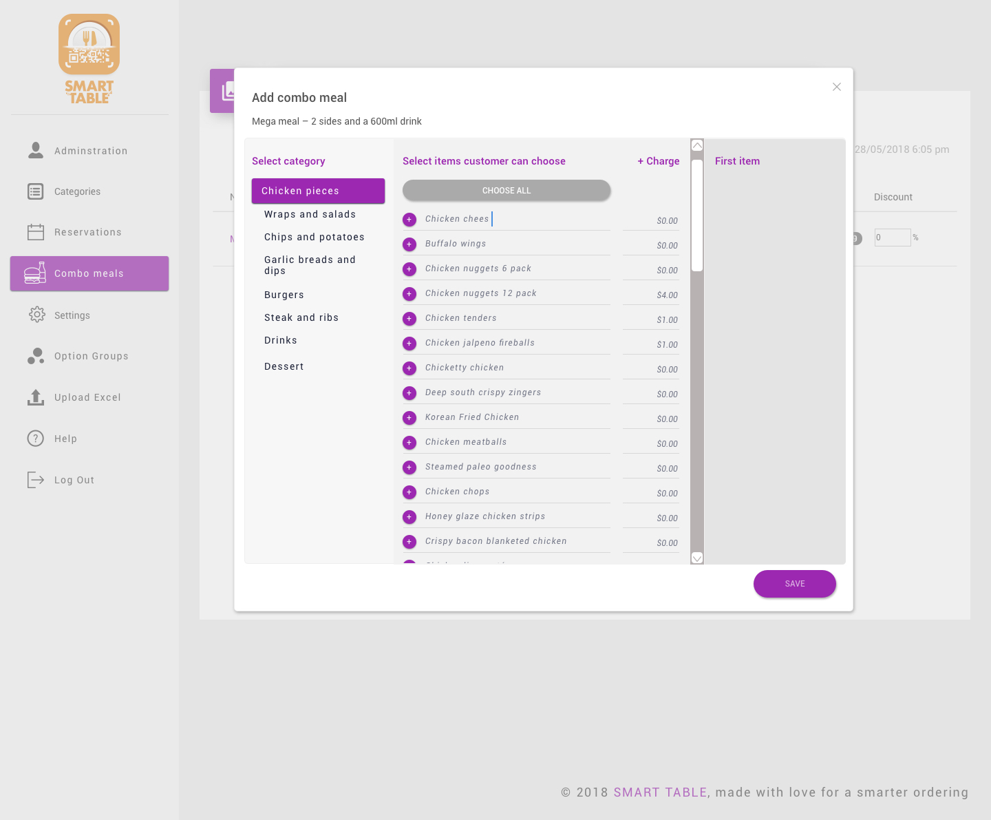
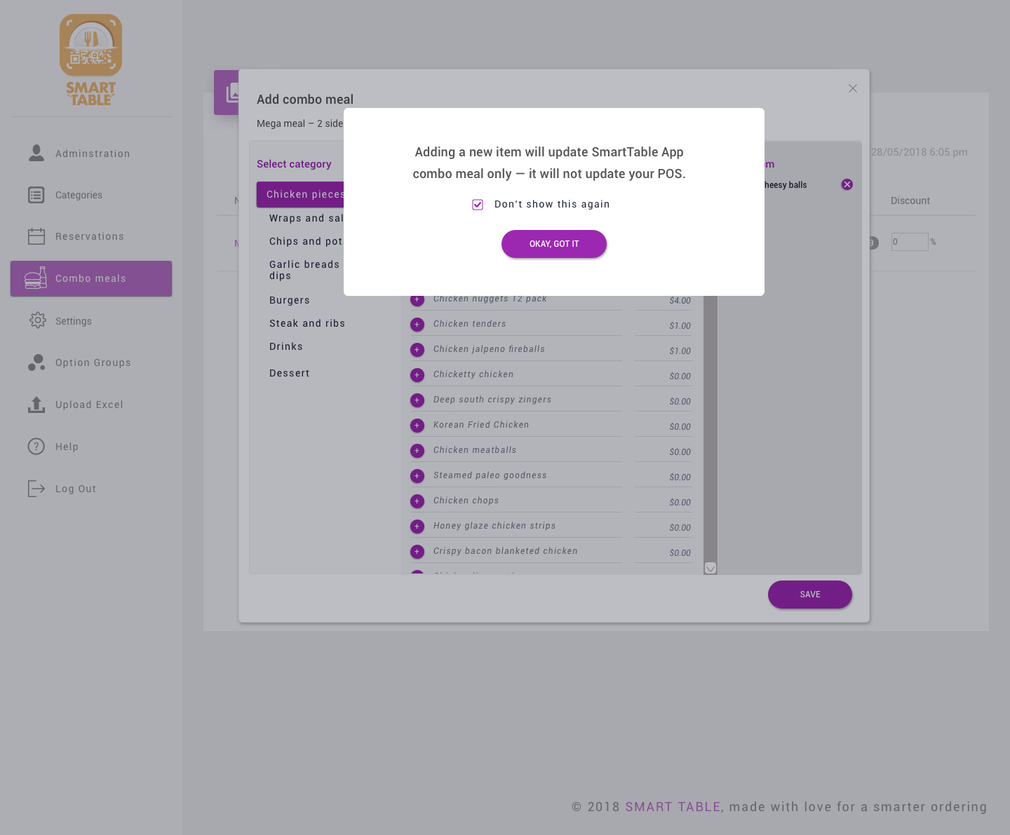
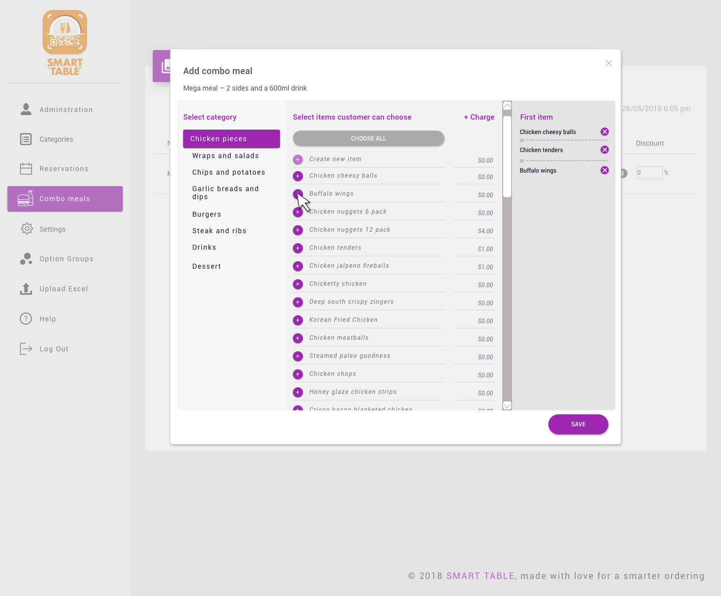
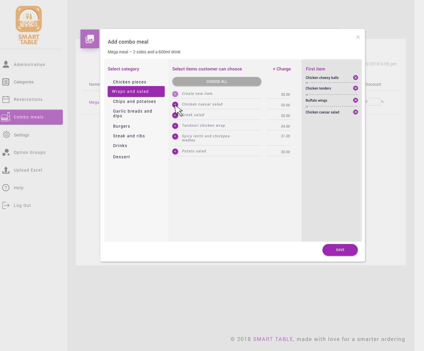
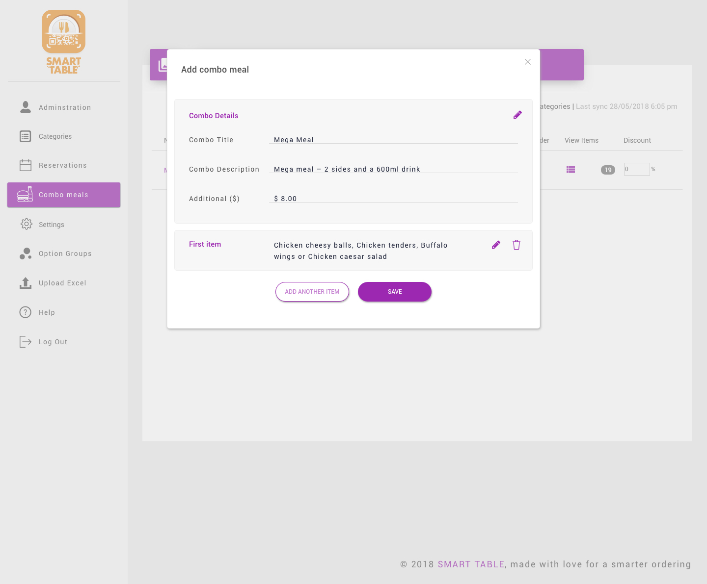
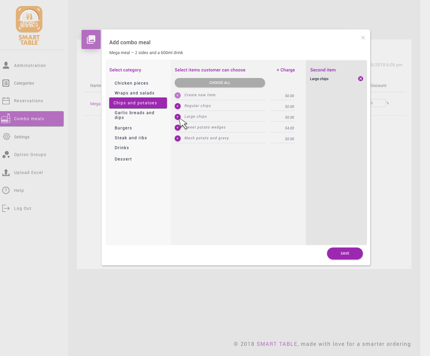
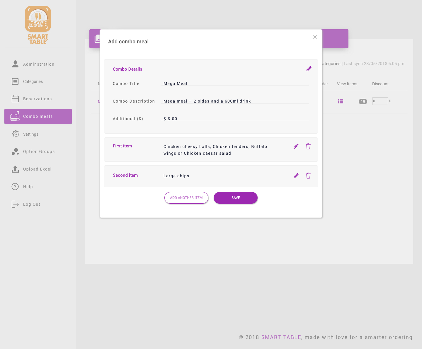
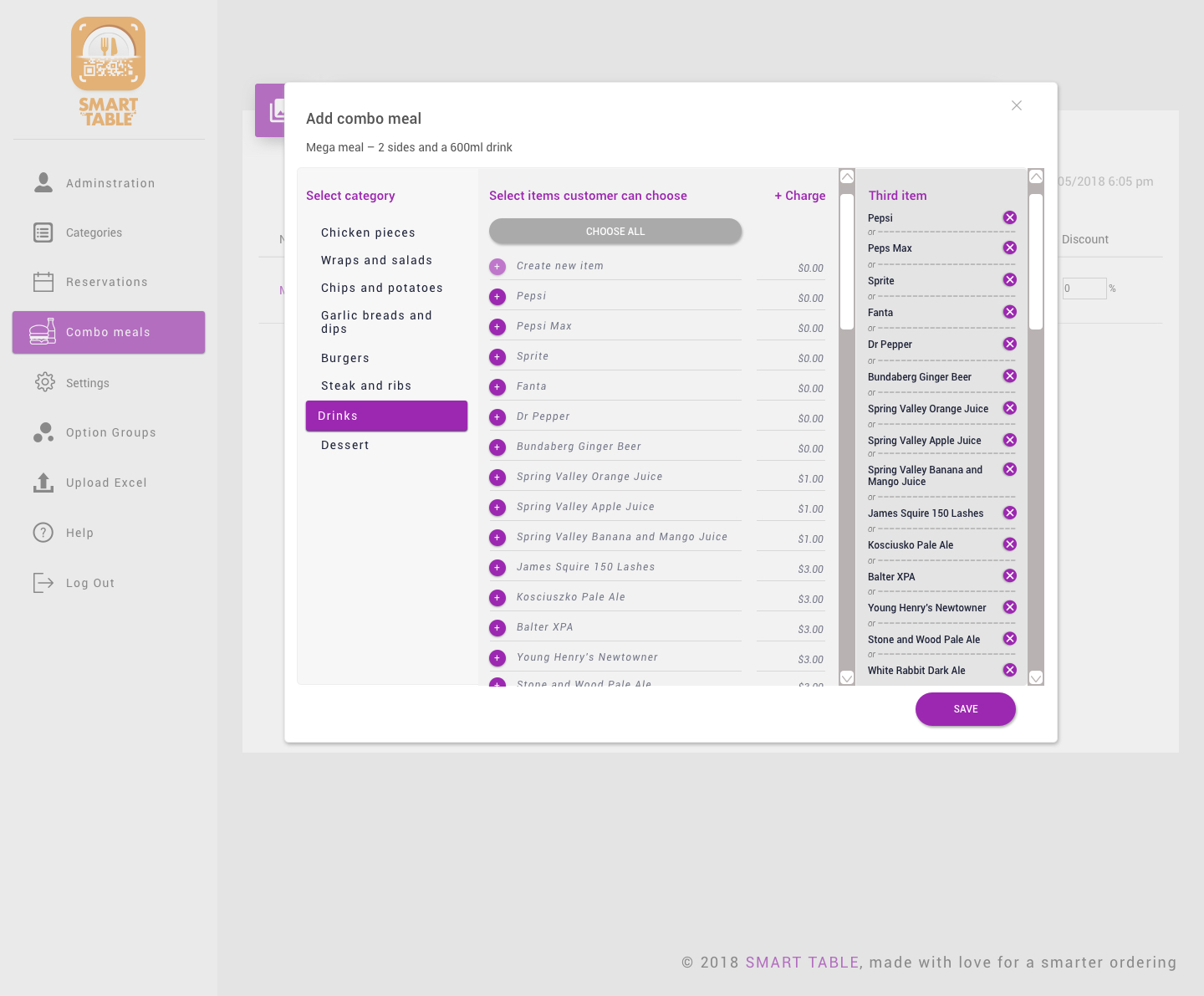
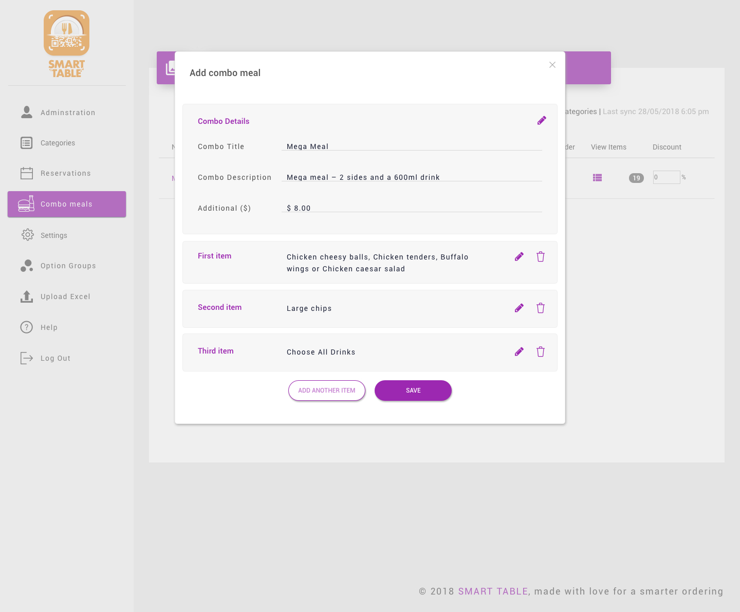
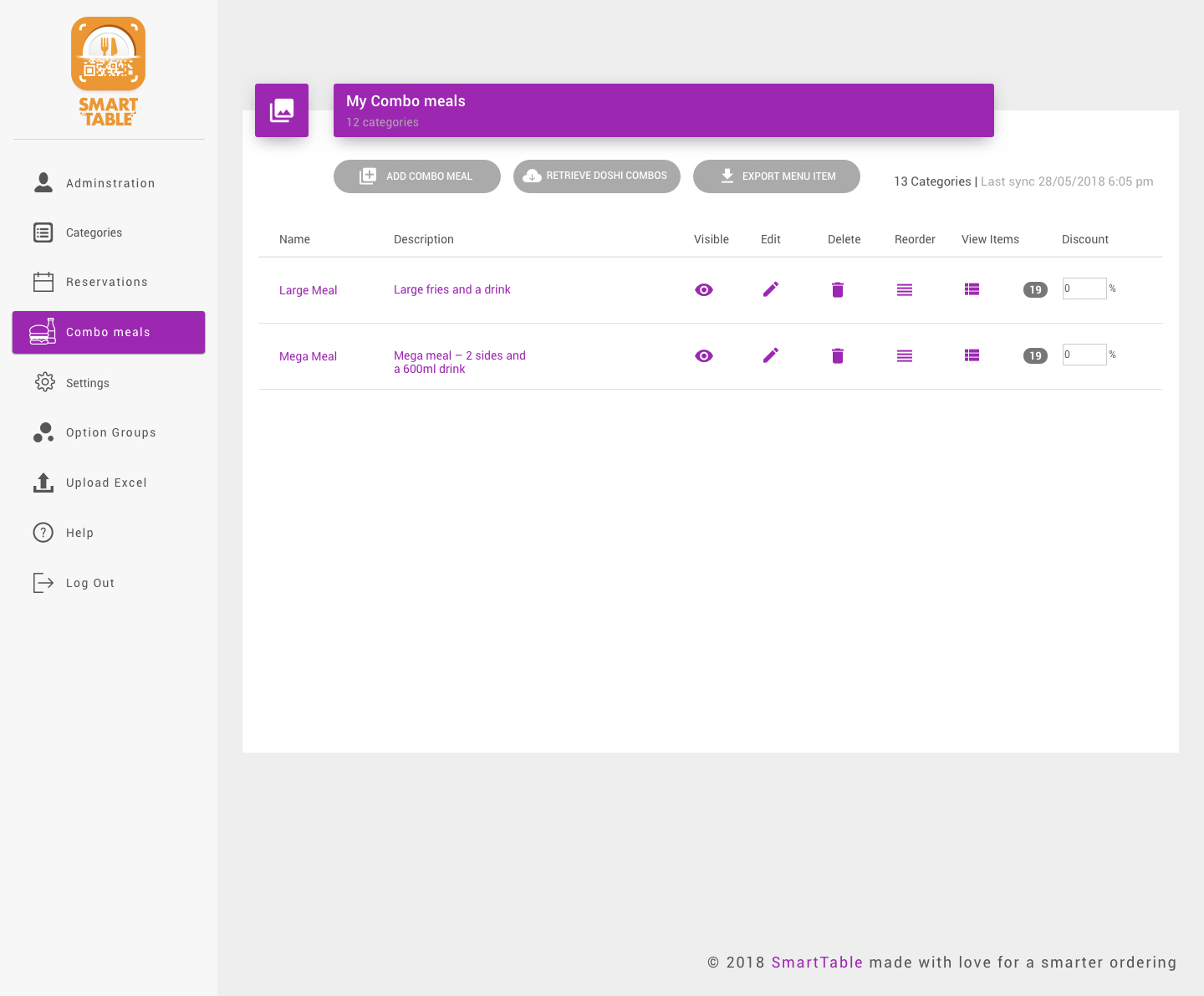
Vendor portal combo meal module
The customer UI was relatively straightforward to produce. The backend was not. It took a few rounds of user testing to get right. Vendors needed to be able to log into their SmartTable portal and add options to menu items and create combo meals. To reduce development time, I endeavoured to use as many existing UI elements as I could.
Time based menus
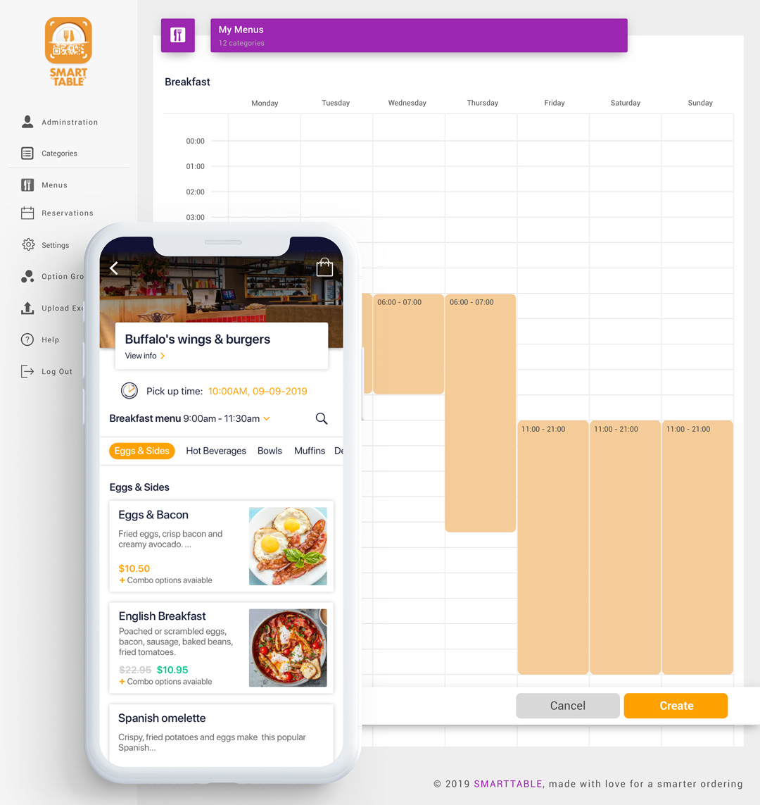
Vendors were requesting more features before they would agree to sign up. One feature we implemented because of this was “time based menus”. In the vendor portal, the restauranteur could set food to time based menu, such as breakfast, lunch or dinner.
We also allowed them to set different times for each day. They could also set items (e.g. beverages) in an “all day” menu, and these items would append to whatever menu was displaying. Menus could also overlap in times.
Giving users options to onboard
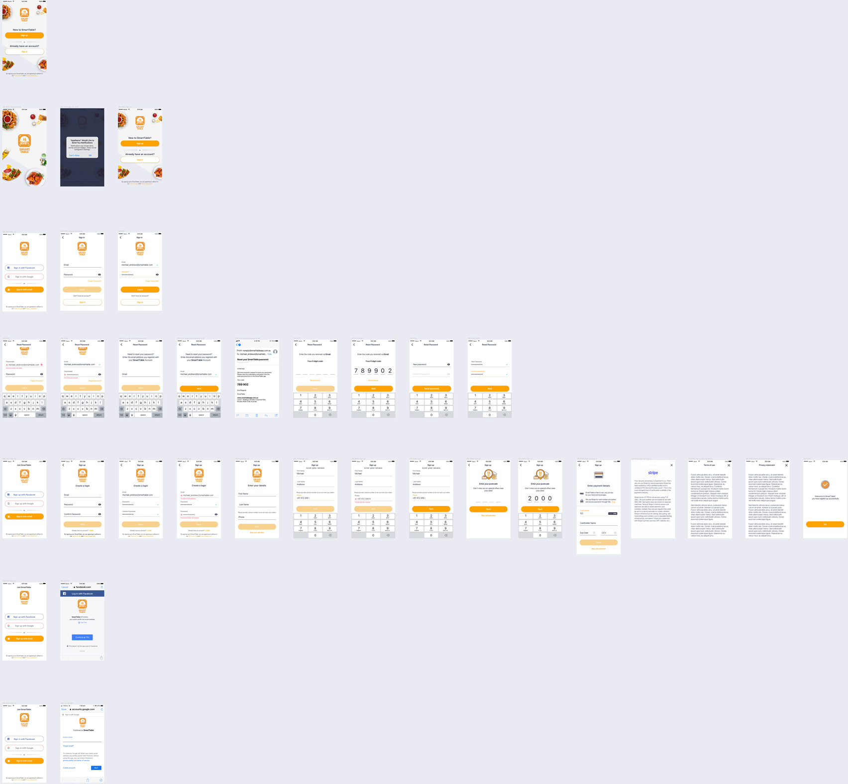
We updated the UI for onboarding based on field research. To assist the marketing department, we obtained the user’s postcode so they could be targeted with the right promotions. We also allowed the user to enter all their information up front if they wanted to, or they could skip and do it later.
To speed up the process, we included Facebook and Google logins. On a research trip to Reviver in Gosford, I noticed that older users were reluctant to enter their credit card details in. To help alleviate their concerns, I added some information about our payment gateway, Stripe’s security.
Improving the cart & checkout
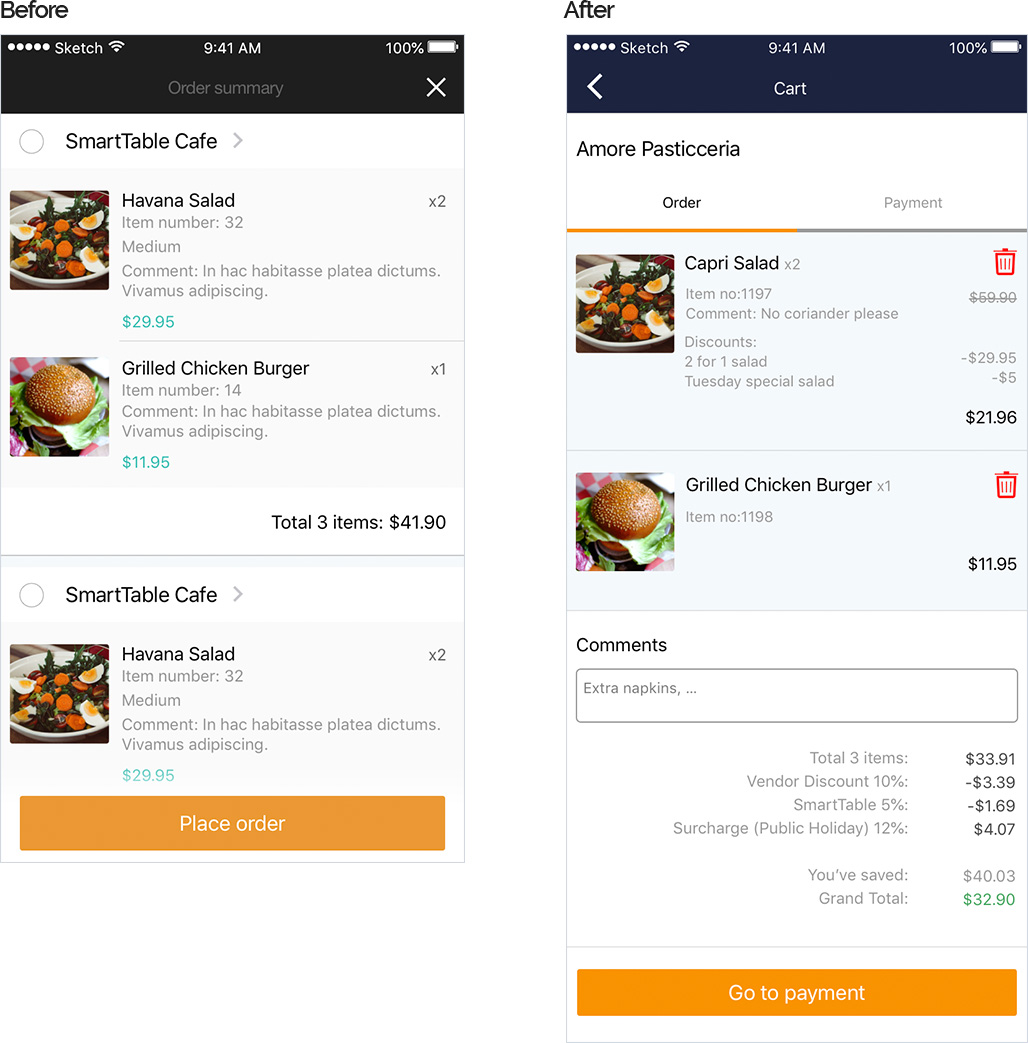
We needed to update the shopping cart and checkout so that it could display discounts and surcharges. We also allowed user to remove items from the cart. In the process I also instructed the designers to right hand align all the prices for food items, discounts and surcharges so that all the numbers were in a right hand column, giving the user a more logical layout to read.

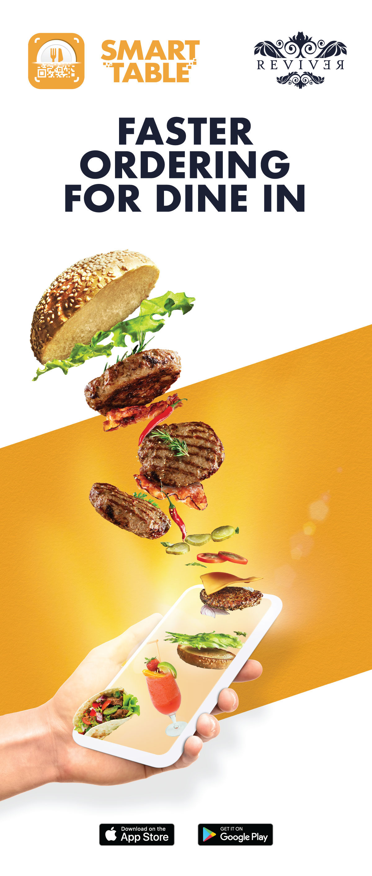
I provided creative direction for promotional materials.
More features = added complexity
The Impos integration was successful. Whilst we had lost all of our original eighty vendors, we were able to find another two new ones to get on board with SmartTable – Reviver in Gosford and Buffalos Wings and Burgers in Liverpool. Soon after, we reintroduced the takeaway feature back in.
The takeaway feature added an extra level of complexity to the app. Dine in was relatively simple – scan the QR code on the venue’s table and start ordering. However, takeaway was structured much like other mainstream food delivery apps – browse through restaurants and menus and then start ordering.
These different pathways did cause some confusion for some users, particularly the less tech savvy ones. For example, some users would come into the restaurant, not notice the QR code and start ordering from the takeaway menu. The wait staff would not know and it would sit behind the counter with them expecting someone to walk in and pick it up!
I was pleased with this feedback, because it gave us a mandate to improve the app further.
Decisions
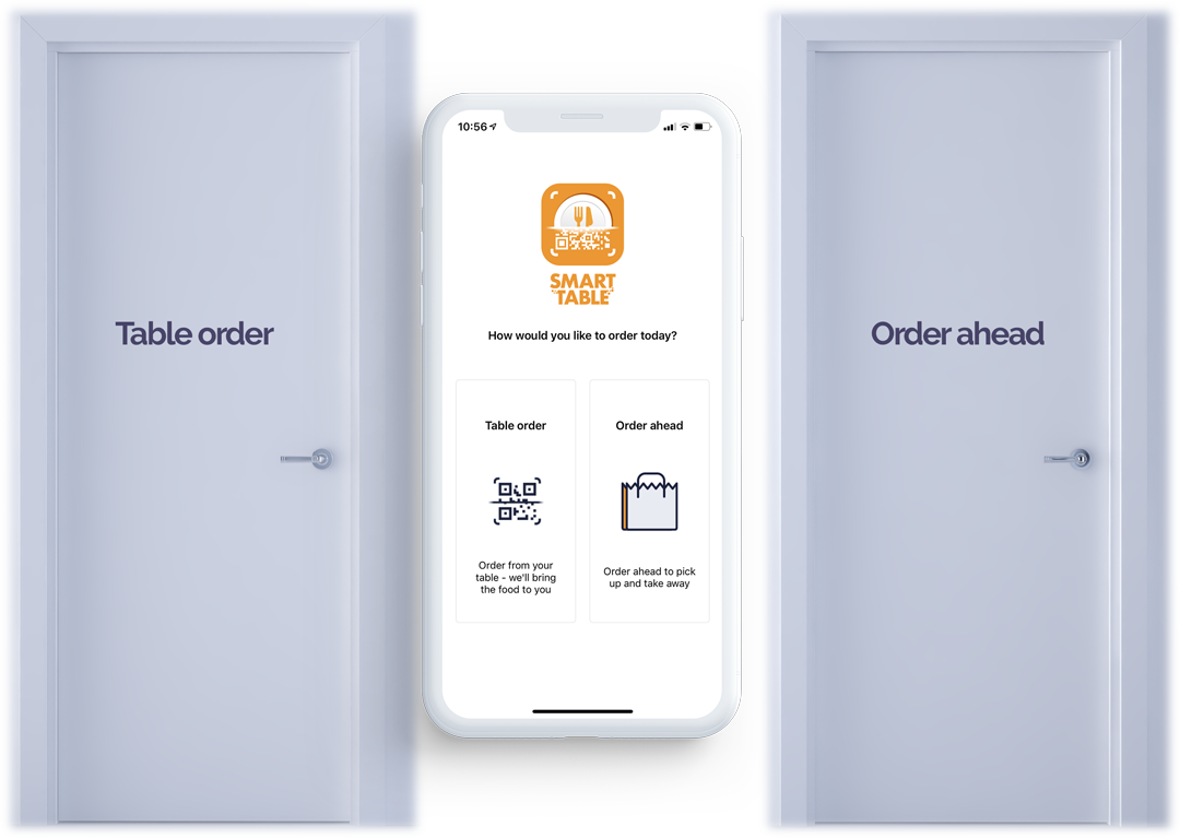
Management’s solution to usability issues was to put a gateway at the beginning of the app.
The product owner and I felt this was a poor decision. It forced users to decide on how to order before they could browse through the app and it prevented the user from seeing any promotions. Keen to “find efficiencies”, management did not see value in UI Design so it was skipped (and it showed).
Initiating research
The usability of the app had been compromised and it needed to be remedied. To find users I self funded a meet-up at a pub and got users to test the app and an Invision prototype. My assumptions were correct. As one user said, “Why are you asking me how I want to order when I do not even know where I can order from?”.
Afterwards I then setup an Optimal Sort survey and got ten people who had never seen the app to sort the order of steps for food ordering into what they felt was logical. Again, my assumptions were validated. The most common order was:
- Select restaurant you wish to order from
- Choose how you would like to order – dine in or takeaway
- Choose food items
- Select time to pickup order
- Pay for food items
- Pick up food
- Eat food
80% of participants wanted to browse through venues first
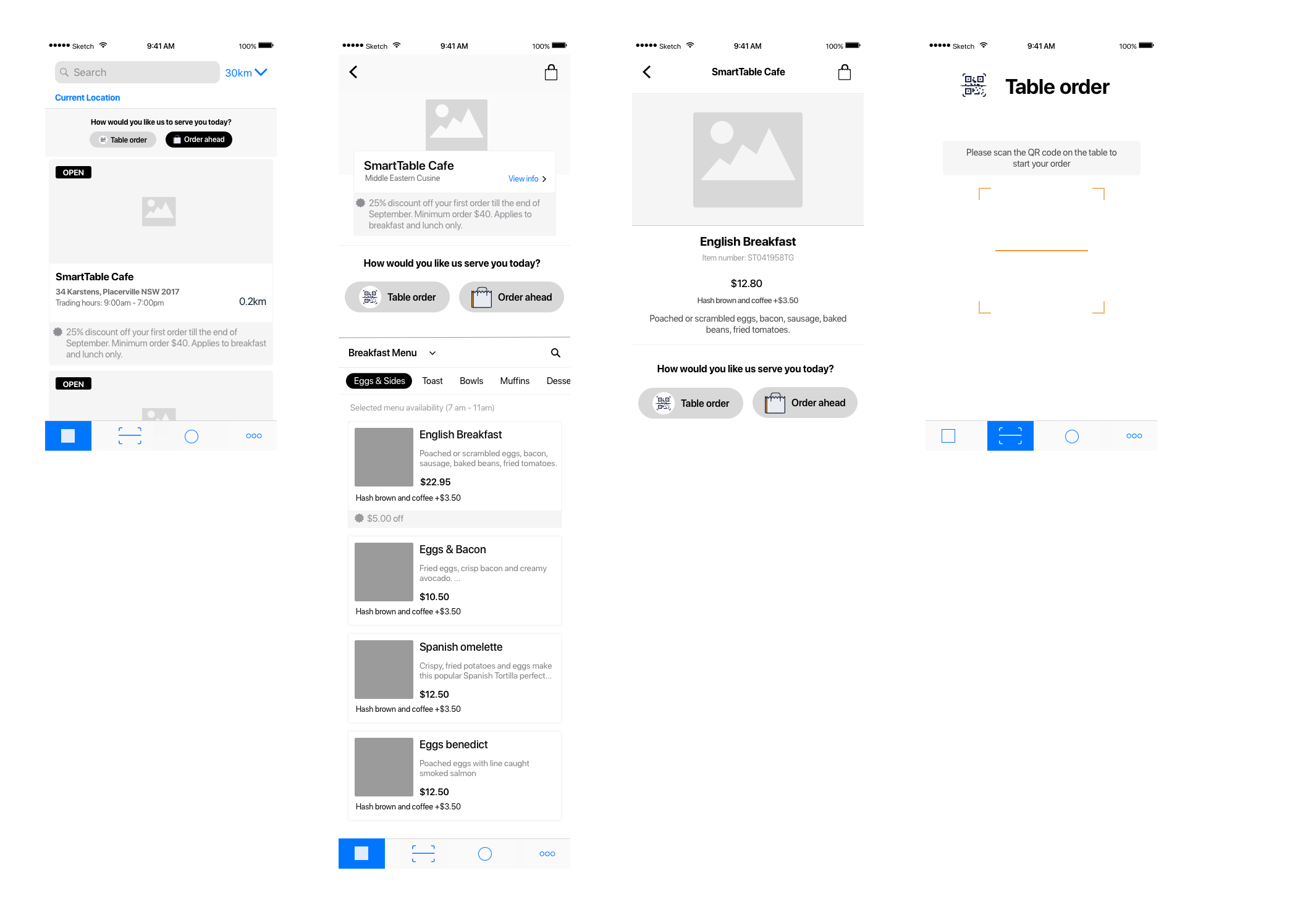
Users could browse through restaurants and menus before deciding how and what to order.
Building flexible user pathways
I was fortunate to have Product Owner on side. He agreed the UX of the customer app needed fixing. I engaged the services of a Senior UX/Product Designer to help come up with a solution and together we took Invision prototypes to Rhodes Waterside and harassed shoppers to try them out. We tested on five participants. The solution she came up with tested well. We made a few minor revisions, such as moving the time-based menu time below categories (users confused this with the pickup time).

If the user changed their pickup time (for takeaway) the cart would validate whether the items were still available at that time.
So, where is it now?
SmartTable made it out into the wild in a small number of venues, but the process of downloading and installing an app proved to be too big a friction point for customers in these particular venues. That said, there is still a place for takeaway and dine-in food ordering apps. Should it have been trialled in busier venues, where it is difficult to get service, I am confident we could have been more successful. Had it made it to COVID19 times, where customers and staff want to avoid as much contact as possible, who knows where that app could be. Many near identical table service and pickup food ordering apps are now becoming popular. Timing (and funding) is everything.
Sadly in mid-2019, the startup ran out of funding and this project, along with all the others it was responsible for, came to an end.


