| Product | Syllable Sushi – online activity for classrooms |
|---|---|
| Enterprise | 3P Learning |
| Year | 2019 |
| Project methodology | Hybrid |
| Target audience | Primary school teachers to use with students in grades K-3 |
| Role | UX Designer |
Breaking up words into component sounds can help contribute towards young students improving their spelling skills1.
We were tasked with creating activities for K-3 students that were focused on pedagogical methods of teaching orthography, with an emphasis on pedagogy rather than gamification. The activities needed to be aligned with school curriculums for English speaking countries. Syllable Sushi is one of those activities.

Chunking
Titled Syllable Karate on the roadmap, this activity would focus on breaking words down into syllables. The basic mechanics of the activity had already been envisioned by the previous Product Manager and followed the same principles of a common classroom activity – hearing words and counting their syllables. Understanding syllables help students break words down into more man-age-a-ble chunks.
Creative concepts
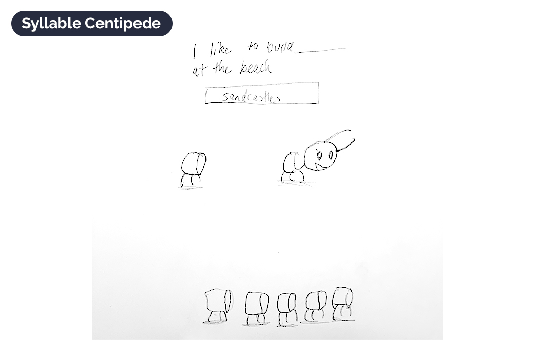
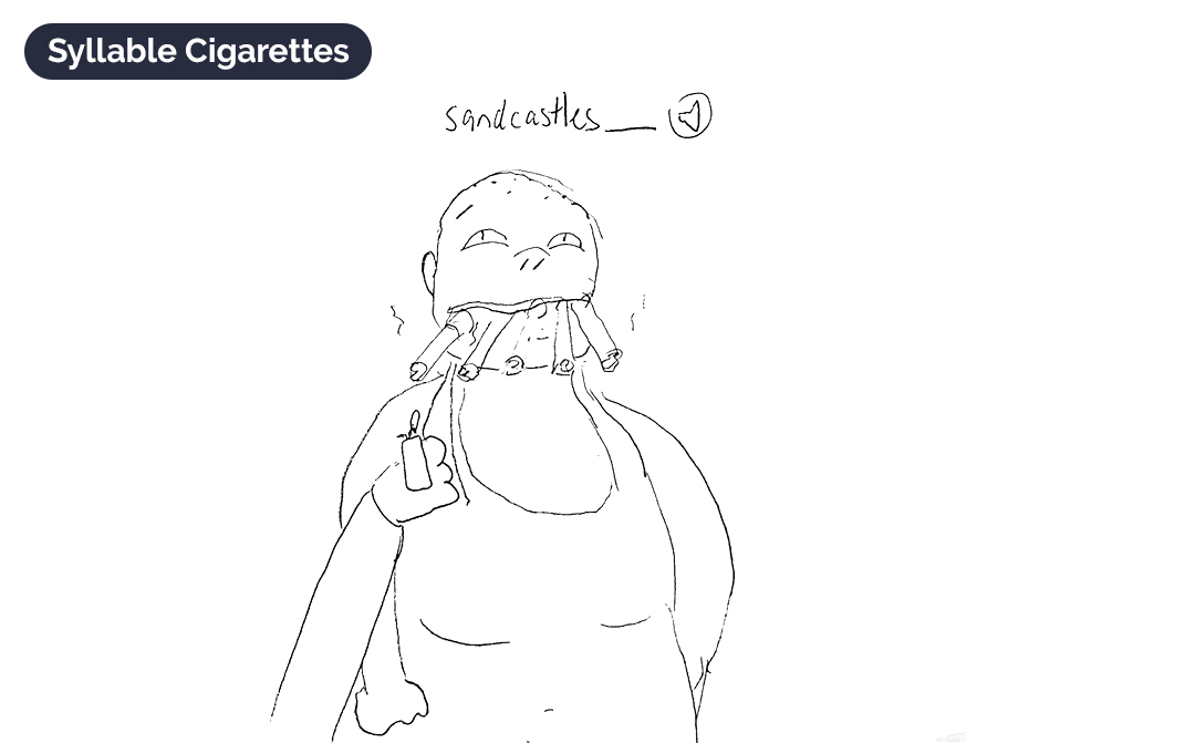
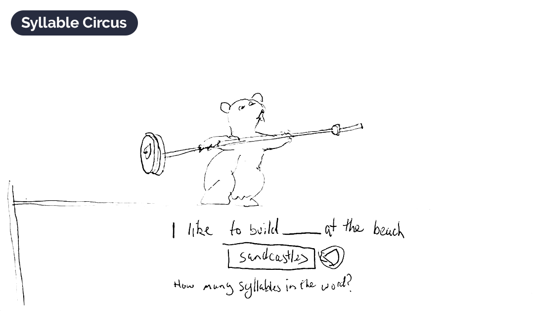
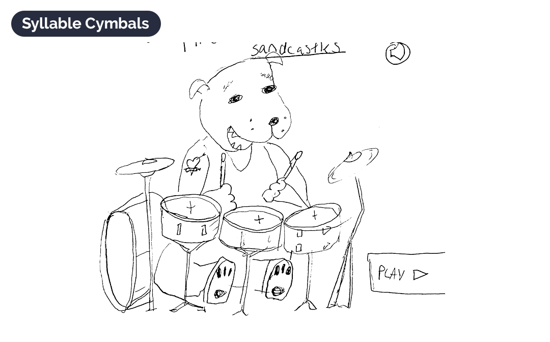
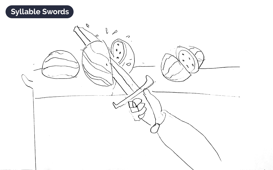
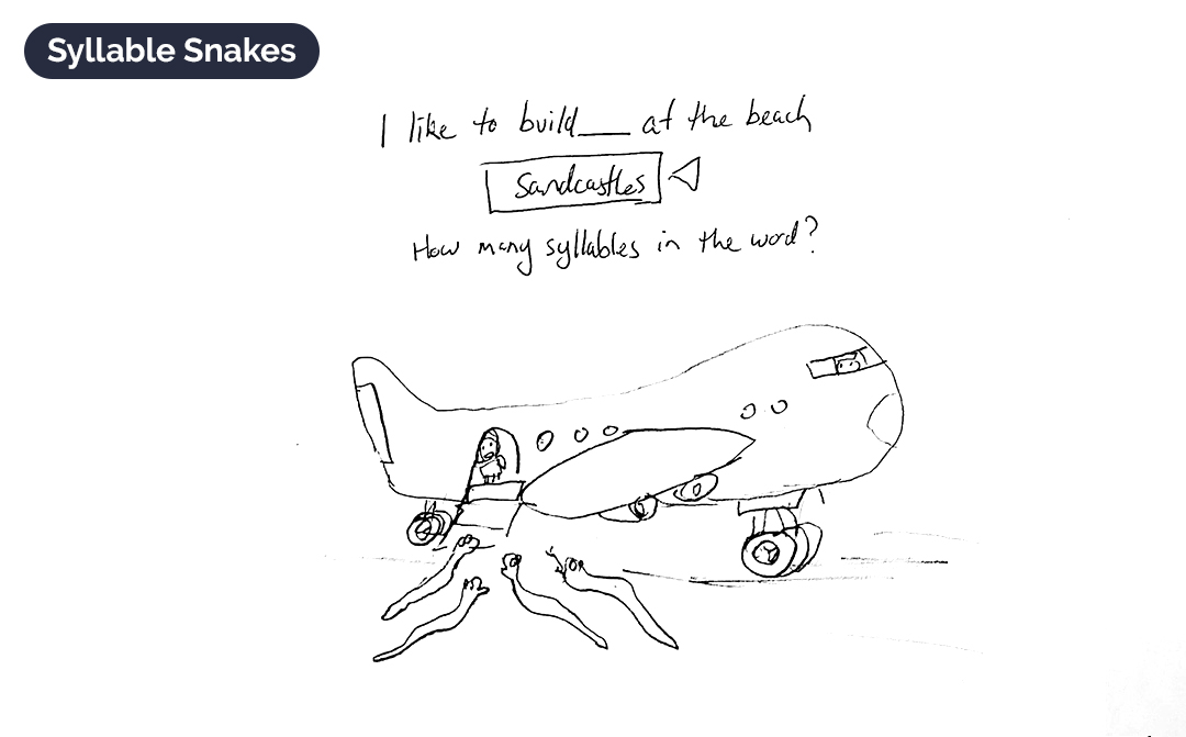
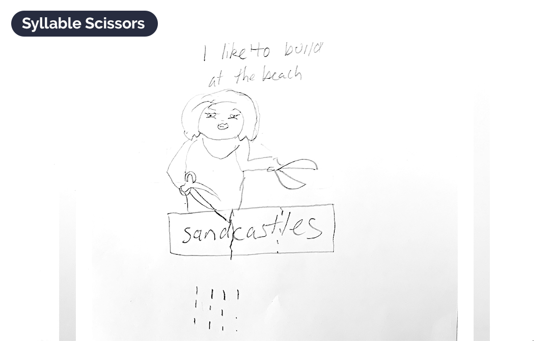
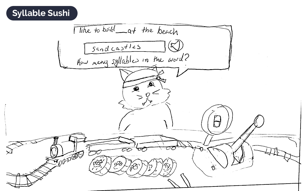
The initial idea for the game was “Syllable Karate”. Students would break the words up into syllables. Not everyone was sold on that idea though, so with just a couple of hours to spare I hurriedly sketched a dozen other themes that could be used to count (or break words up into) syllables. It should be noted that I was not actually serious about a couple of those ideas, but it was useful to have a sizeable volume for the team to discuss.
Thankfully the team chose Syllable Sushi!
Lo-Fi prototype
Over a two week sprint (whilst juggling other projects) I used Sketch App and InVision to create a lo-fi prototype for stakeholders to play through. Whilst there was no time allocated to test the prototype on users, it still proved useful for getting feedback from the rest of the Literacy Team at 3P Learning.
UI design and development
Collaborating with the developers we made a few subtle changes to the design, including some layout design and simplifying some of the elements such as the sushi train. To meet the deadline, “drag and drop” was also discarded. We also needed to make changes to the results screen to allow for long words such as antidisestablishmentarianism.
Credit where credit is due: the fine UI work you see here was handled by Jola, our UI designer who also worked on solving all the responsive screen challenges.
Magic Boxes
With Syllable Sushi in the development phase, we started work on designing Magic Boxes which would borrow a lot of the same design patterns. This activity would be built around the principals of Elkonin Boxes. Students sound out the word and break the word into phonemes (the smallest unit of speech sound) and identifying the graphemes (the letters used to make up the sound). Once they have identified the graphemes, they use counters (or boxes) to count how many there are in the word.
Students are rewarded with animations of the rabbit performing magic tricks when they get a question right. Additional extrinsic motivators were included such as points, badges, certificates and access to “Meritopia”, the 3P rewards world.
Usability testing
The design team had identified the build of both Magic Boxes and Syllable Sushi was not quite as per the design. On Windows devices in particular, there were scaling issues. Microsoft recommends scaling of 150% on many of its laptops, and on these devices the application’s elements were huge! Whilst I’m normally in favour of large type and big buttons, much of the important functionality was pushed below the fold of the screen.
Fixing these problems meant chewing up expensive development time and some members of the team did not see value in doing that. Fortunately another project was undergoing some usability testing and I was able to get both Syllable Sushi and Magic Boxes tested in those sessions.
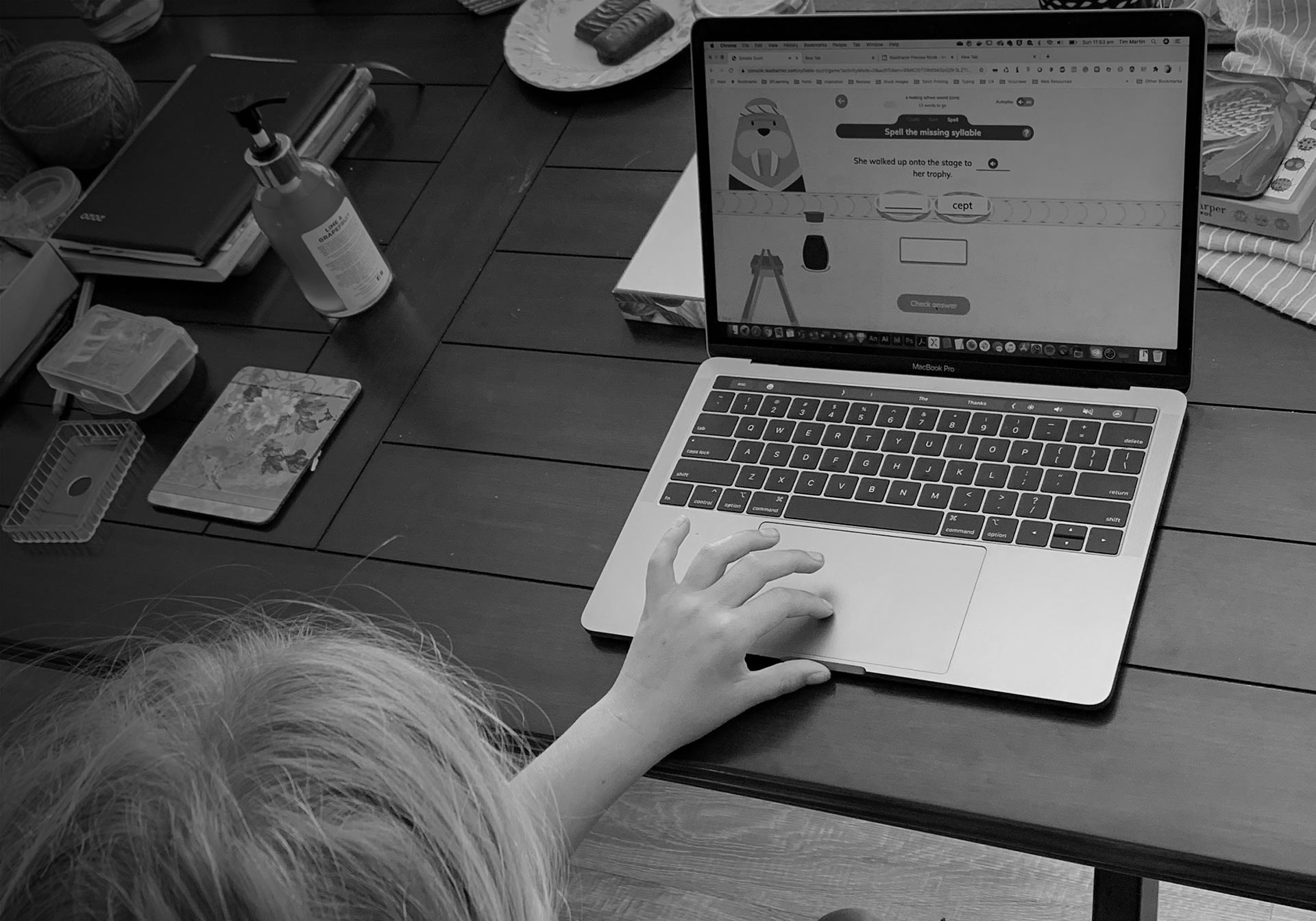
My assumptions were correct – students struggled to use the applications and needed assistance. We picked up a few other bugs too – for example, autocorrect was still functioning on the iPad, which allowed students to very easily achieve 100% accuracy without trying. With these results I was able to influence the team to fix these issues.
After the development team made the changes, I tested the applications again on nephews and on some of my friends’ children. With the bugs fixed, things ran much more smoothly.
Usage
Since its release in mid 2019, Syllable Sushi has had over 6,000 students visit it each week who pulled apart words, no doubt improving their spelling in the process.
Number of unique students per week
Snapshot taken at 21/04/2021
Without context, the above numbers will mean very little. In comparison to 3P’s maths product Mathletics, these numbers are low – Mathletics has over 3 million students. Of course, Mathletics has benefited from a decade of marketing and growth. Analysing 3P’s previous Flash based literacy product Spellodrome, the above numbers compare more favourably. But there is always room for improvement.
What could be improved
Common feedback from usability testing was that in both Syllable Sushi and Magic Boxes the animations happened too slowly. Students visibly expressed their frustration, frowning, huffing and rolling their eyes (why in-person usability tests are good to do). Whilst animations were sped up, the activity would benefit from having them sped up further to increase the speed of play.
This could be enhanced by adding more randomised animations that would serve as a variable reward mechanic. Of course, this would require resources.
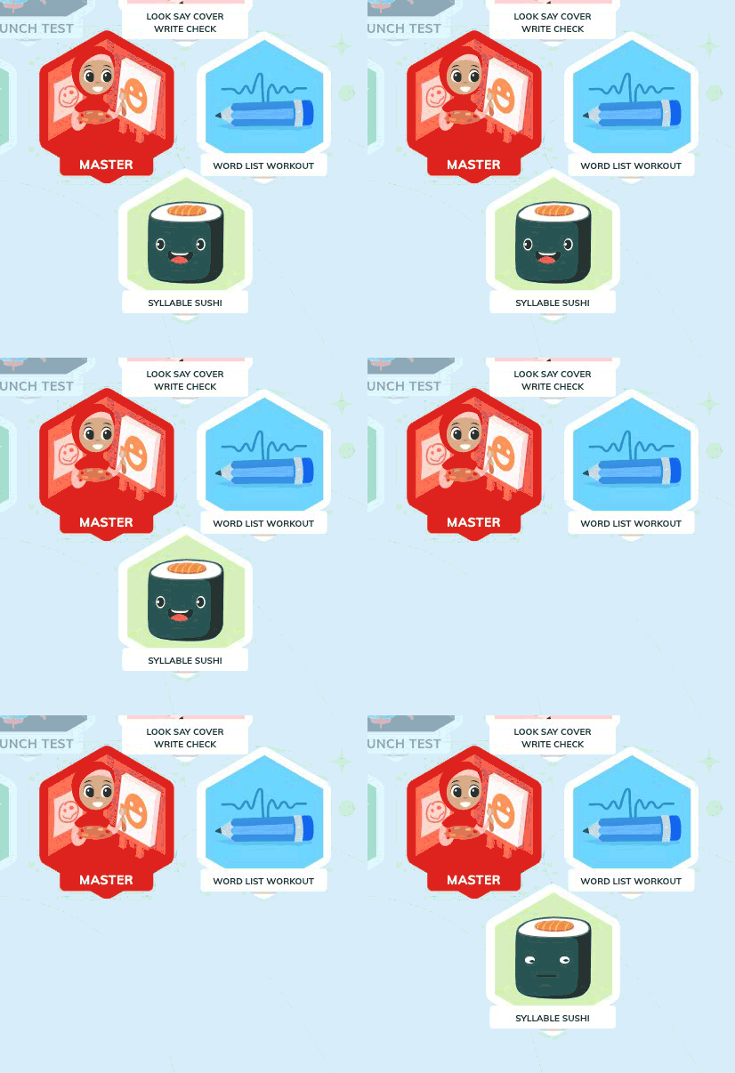
There is another possible reason some students do not engage with Syllable Sushi and Magic Boxes and that is, they simply cannot find them. The “Student Hive” tucks its activities away and the user must click through the hexagon tiles to discover the activities. If the word list does not meet the criteria, the activity will not appear at all and there is nothing to advise either the teacher or student why. Sometimes Magic Boxes won’t be there, and almost like magic, sometimes it will!
Hotjar recordings show many students click around the hexagon tiles haphazardly.
Furthermore, very little was done to educate teachers that the new activities were now available. I presented my hypothesis to the team with a redesign of the student portal, however it was not deemed to be a high priority.


